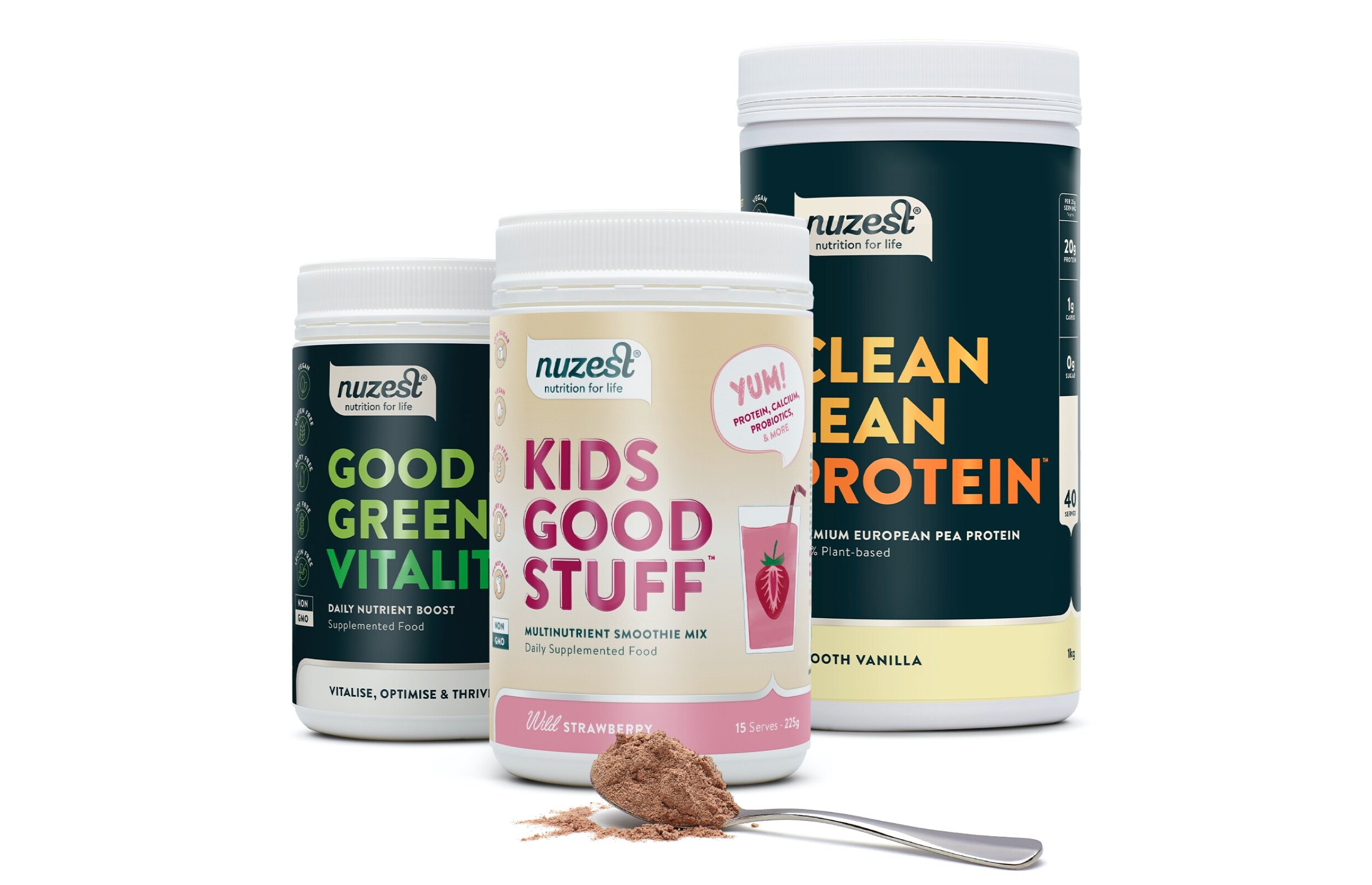
Led by nature, and backed by science, Nuzest products are made using the purest and most potent plant-based ingredients. Distributed across 17 countries, our task was to audit and evolve the three leading ranges: Clean Lean Protein, Good Green Vitality, and Kids Good Stuff, with the goal of creating a distinctive and powerful visual identity that cuts through the clutter of the saturated market.
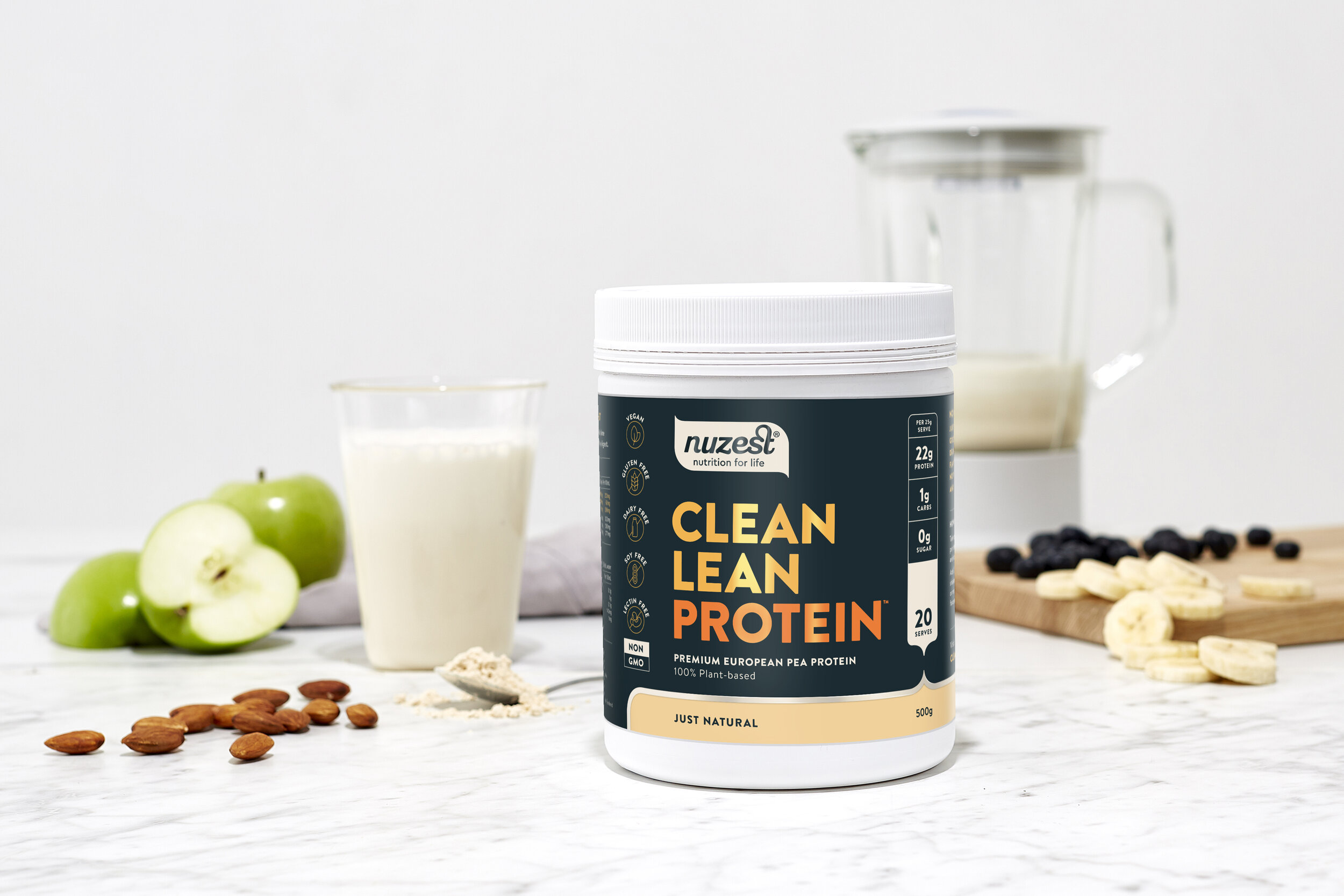
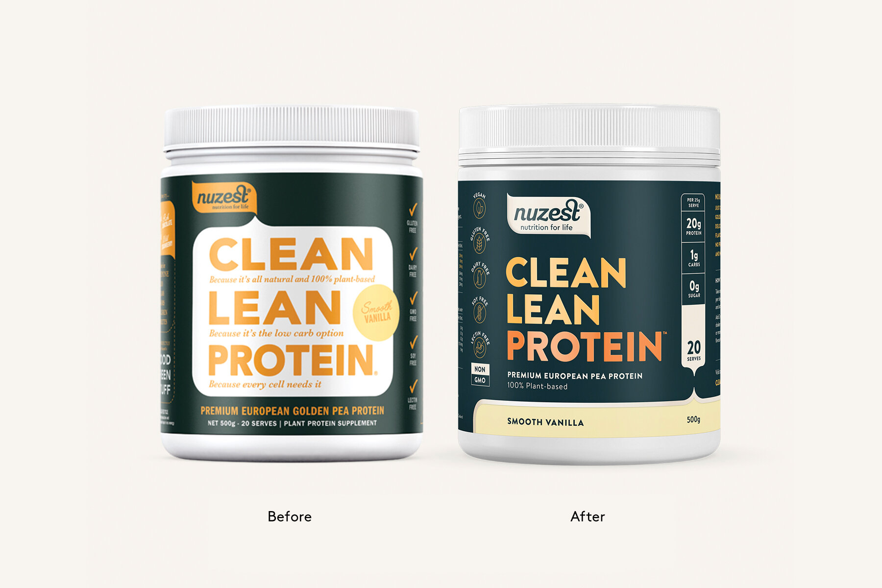
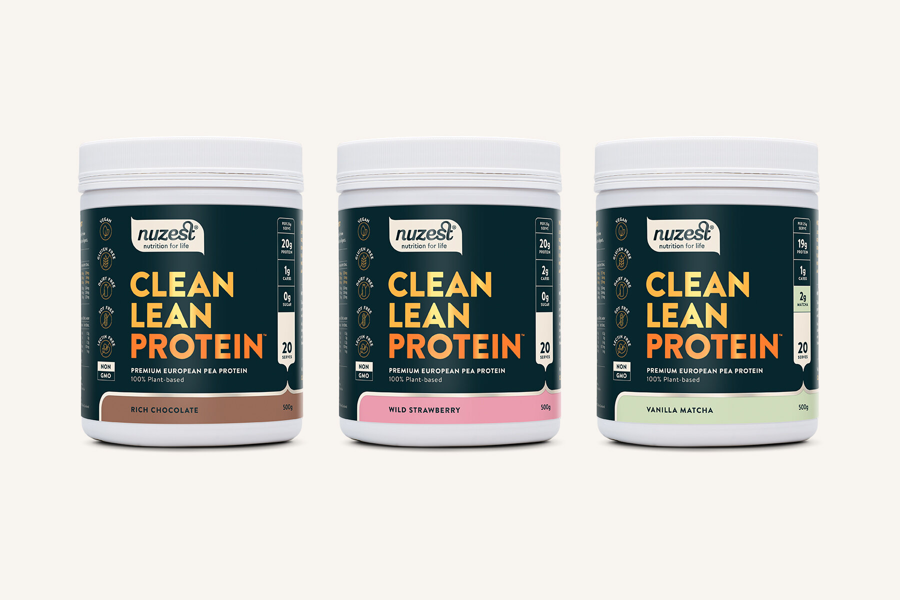
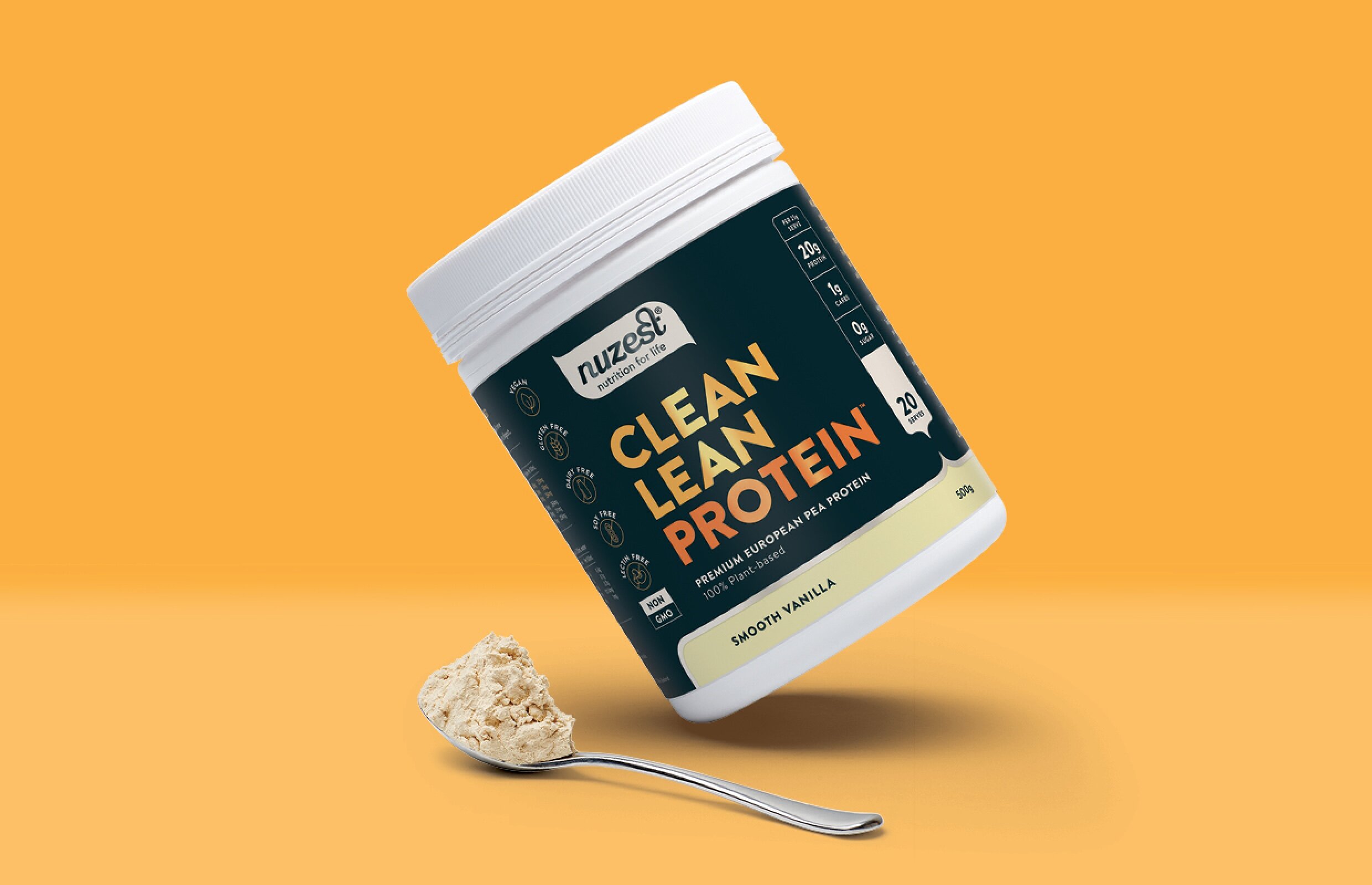
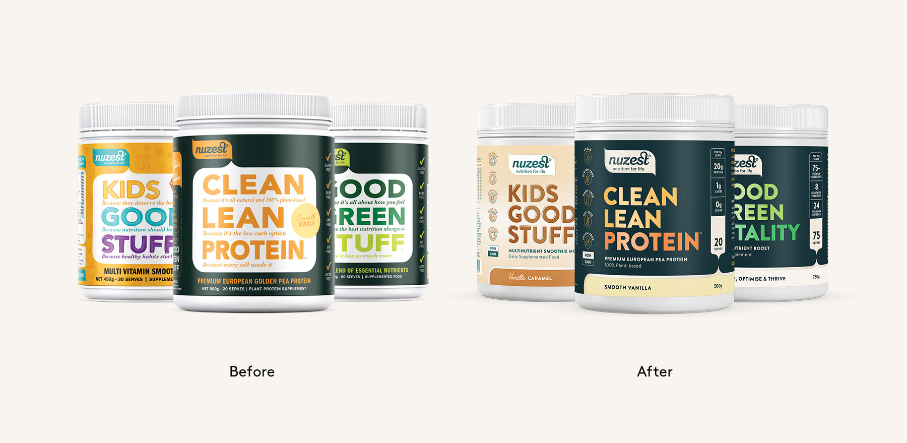
Each of the three ranges presented its own distinct challenges. Clean Lean Protein, Nuzest’s best selling product, was aesthetically losing its position as the benchmark for quality in the protein category, due to cluttered messaging and hierarchy on the labels. Using visual cues and redefined hierarchy of the pack’s hardworking call outs, we achieved a more modern, premium packaging aestetic, with important information clear at a glance.
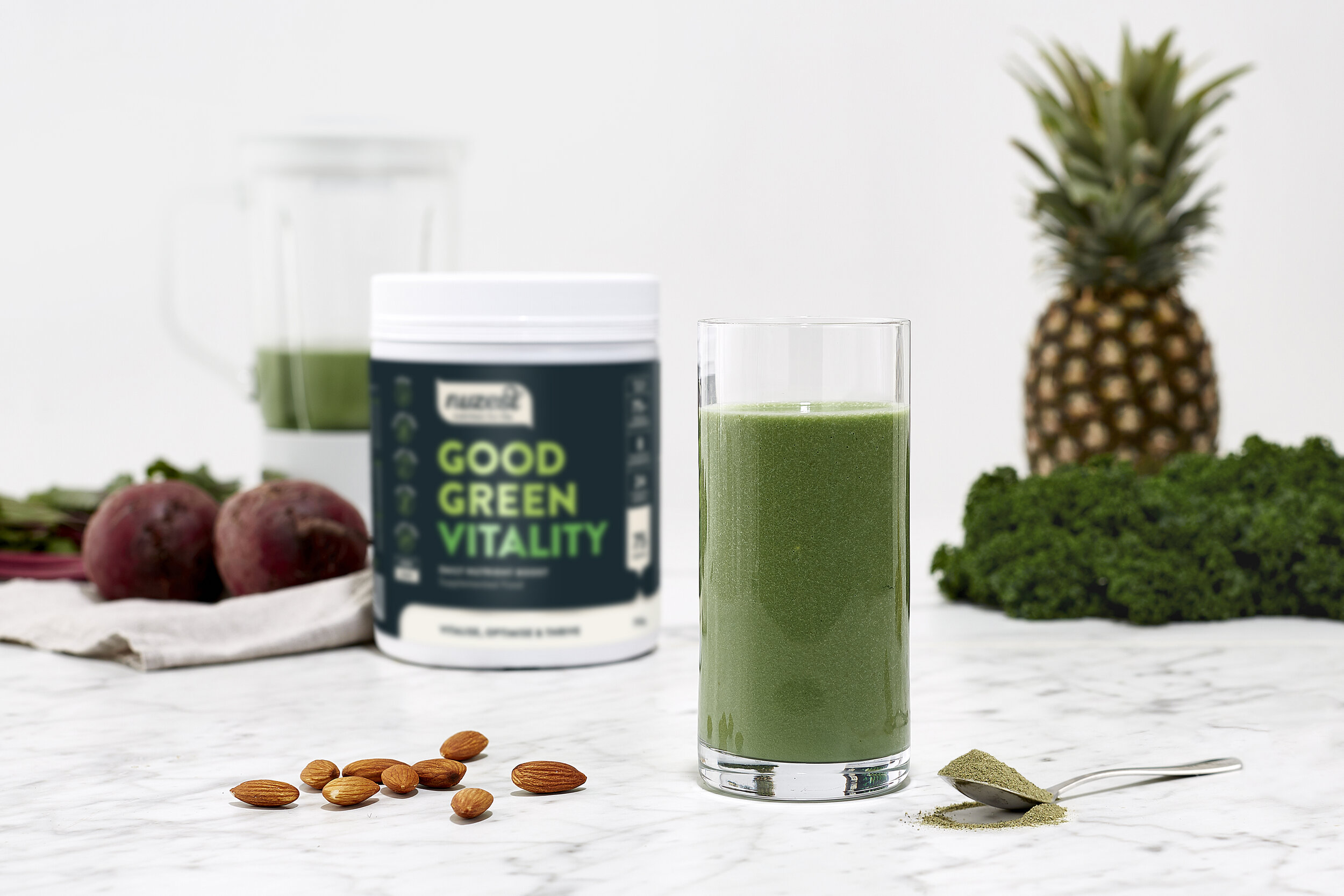
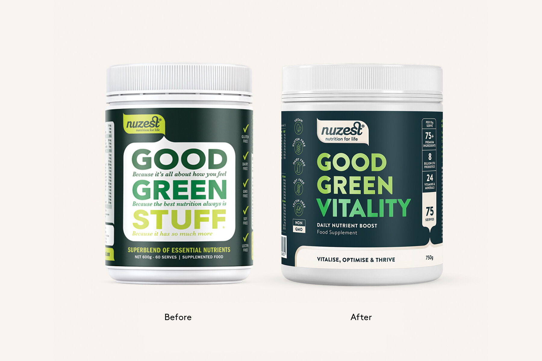
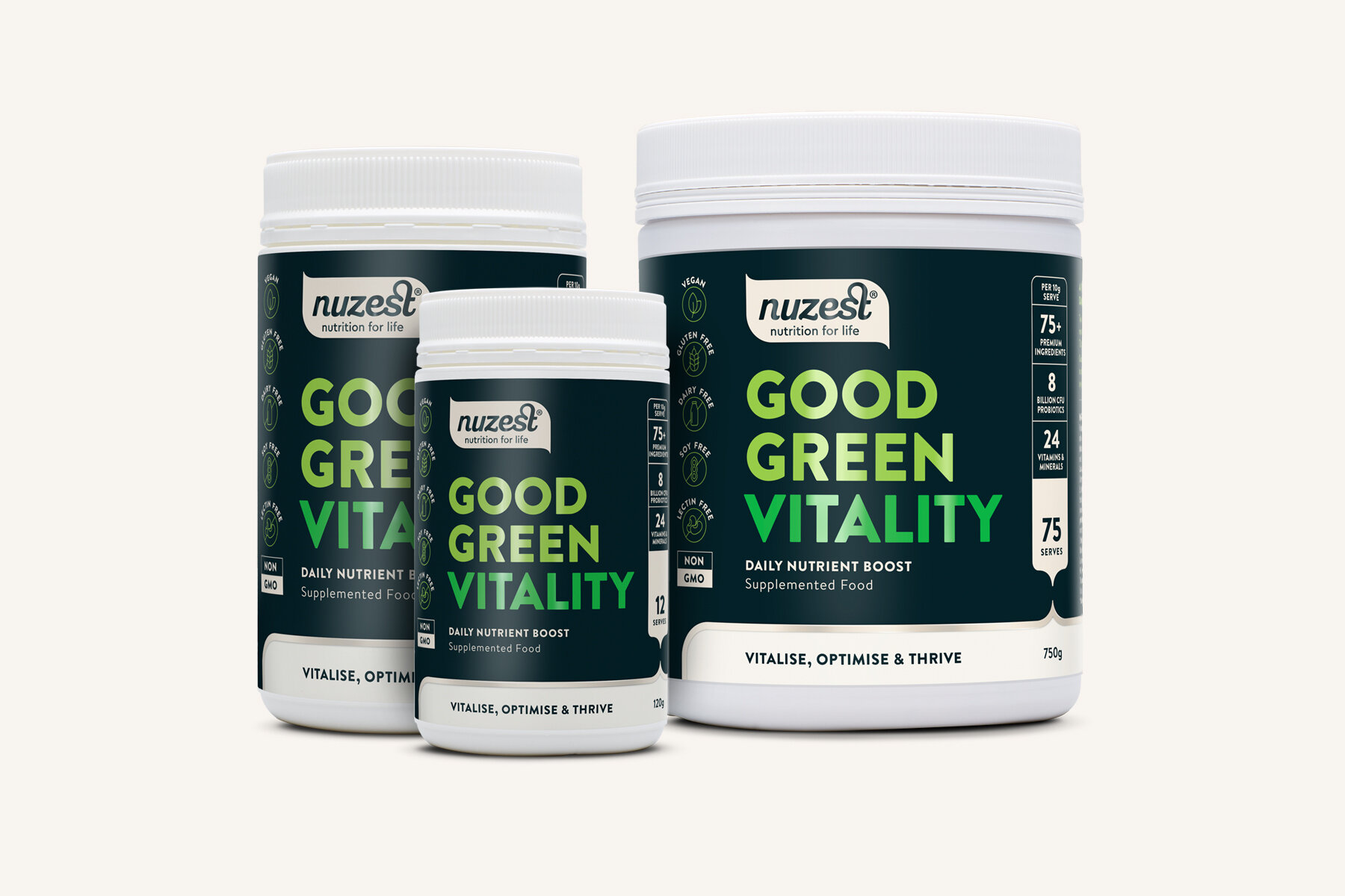
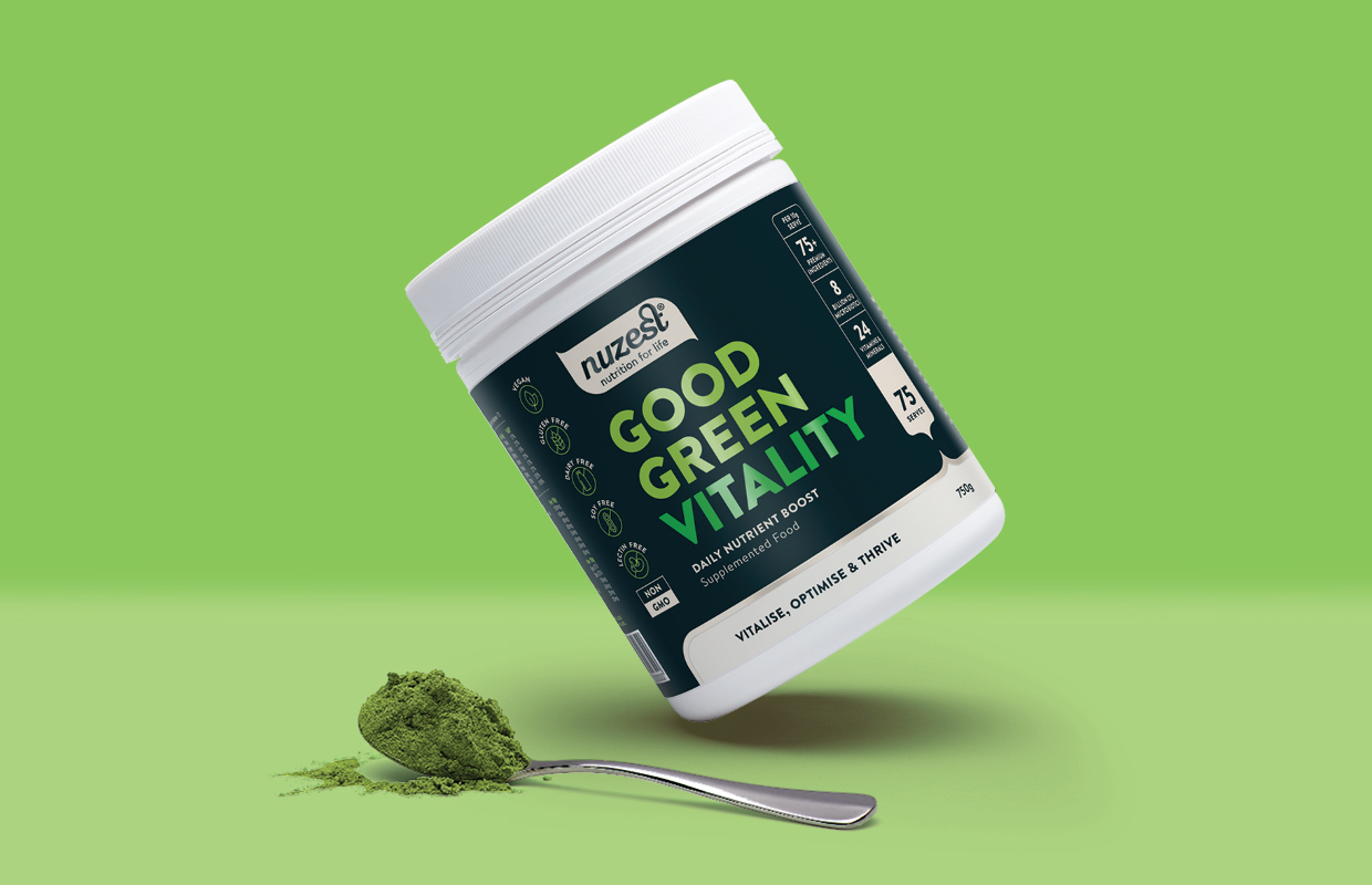
The core challenge of the Good Green Vitality redesign was to position it as the superior complete supplement solution, above competitor ‘green’ products. We transformed Good Green ‘Stuff’ to ‘Vitality’ to better align with the mission, and re-organised the essential information on pack so consumers can read exactly what they need to know at a glance.
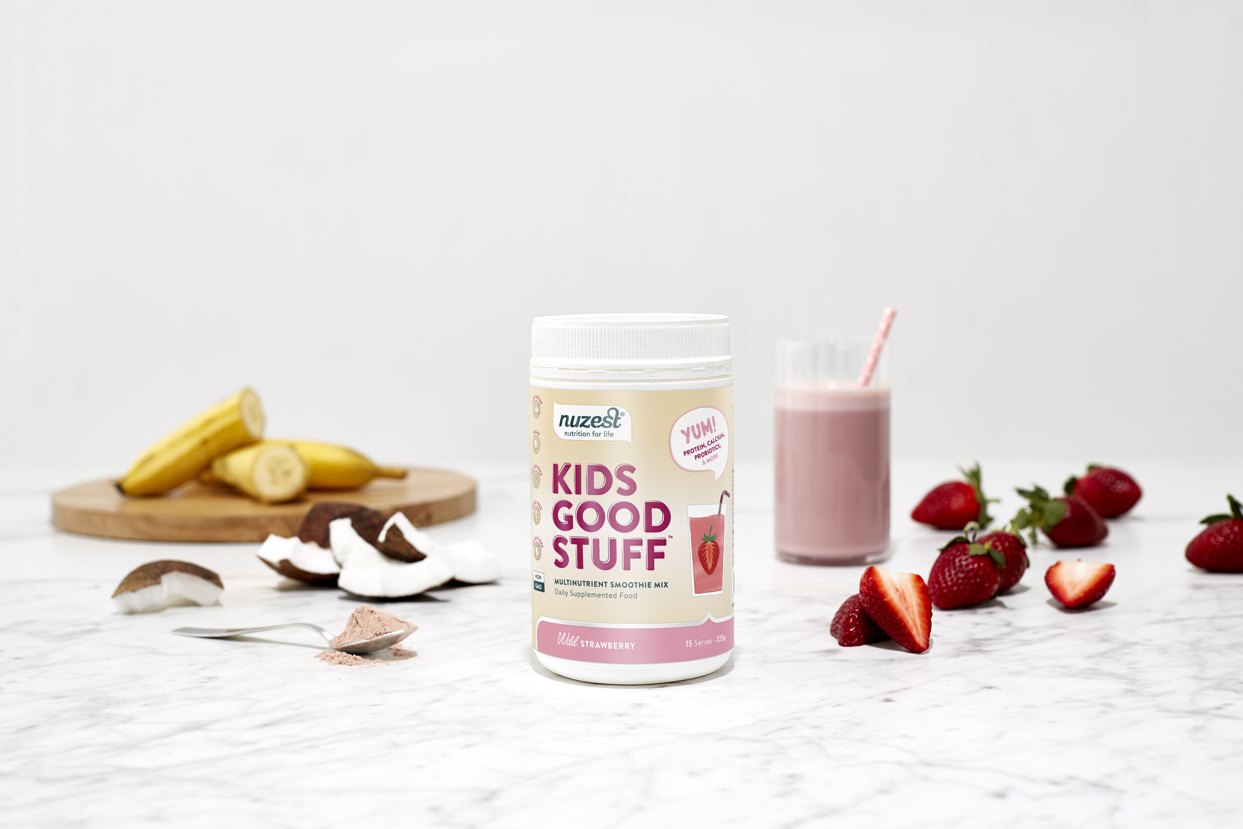
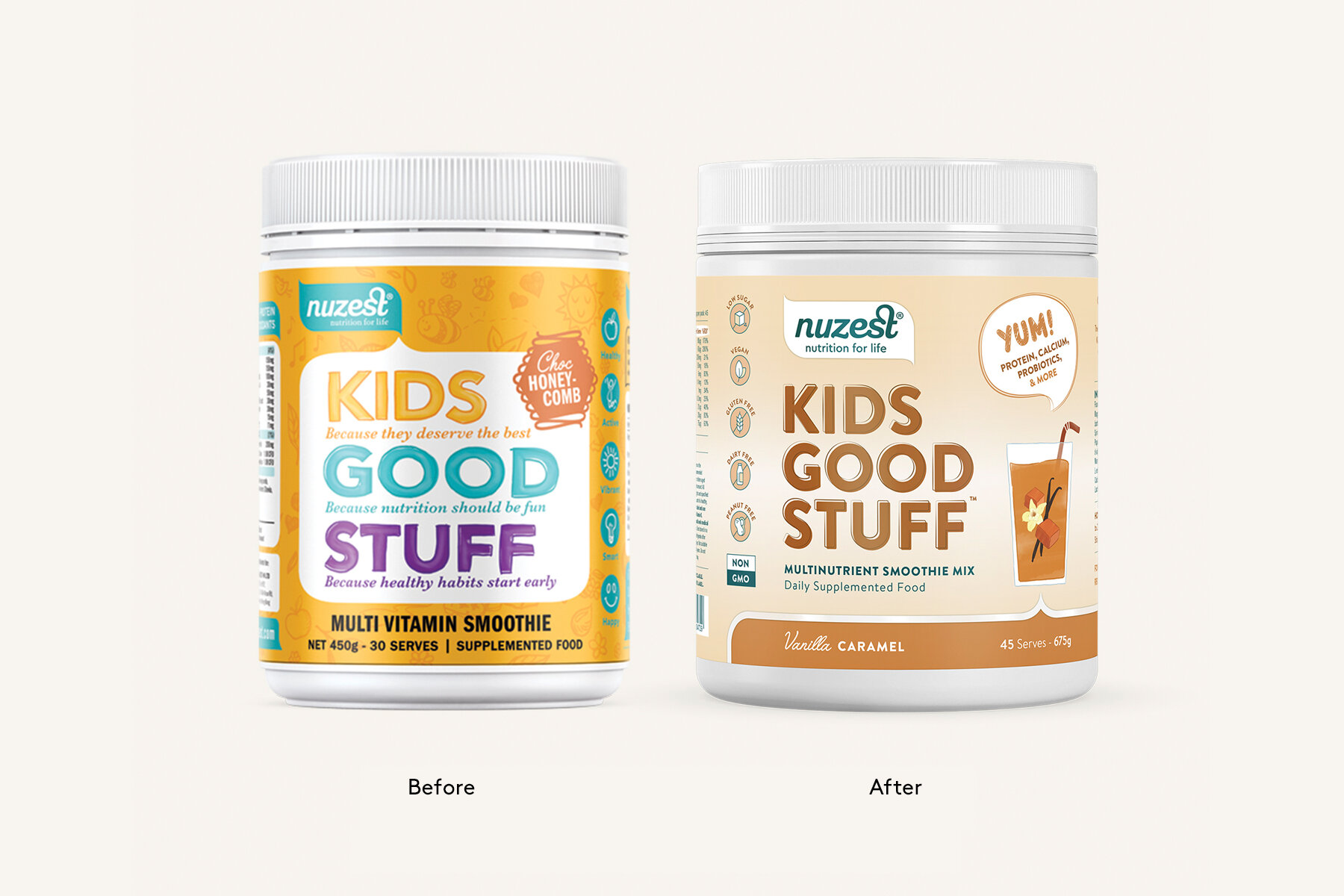
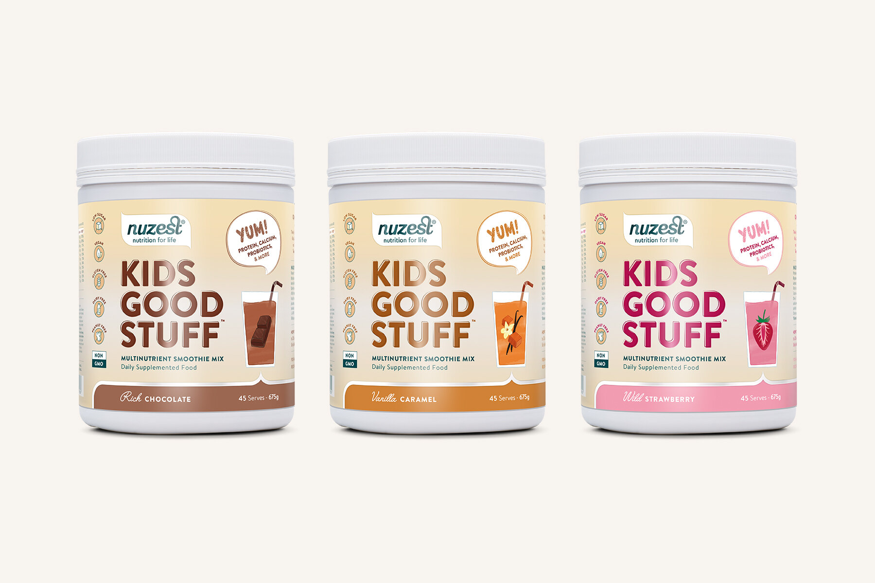
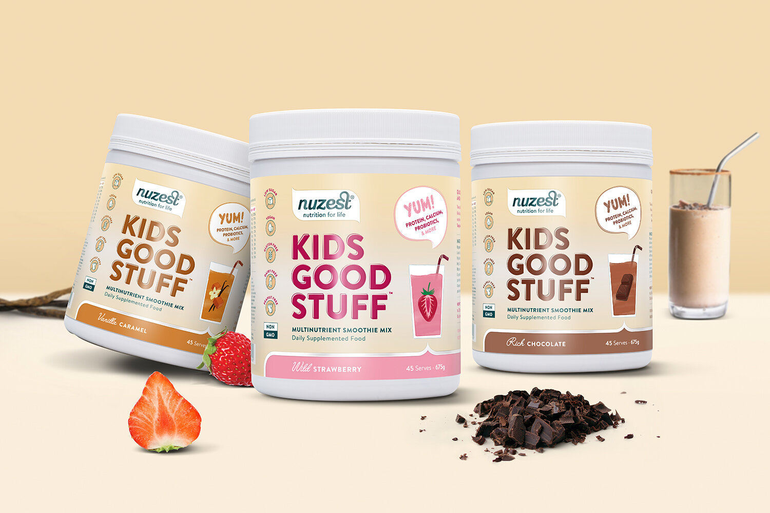
Our task with Kids Good Stuff was to reposition the kids range to appeal to a broader age group and to reinforce its premium position in the market. We transformed the packaging to have a more natural, premium aesthetic using earthy colours, natural textures and hand drawn illustrations to connect with the ‘real flavours’ used in the product.
Designed at Squad Ink / Creative Direction: Matthew
Nuzest
— Packaging Redesign
CREDITS
Studio — Squad Ink
Client — Nuzest
Creative Director — Matthew Squadrito
Photography — Nuzest